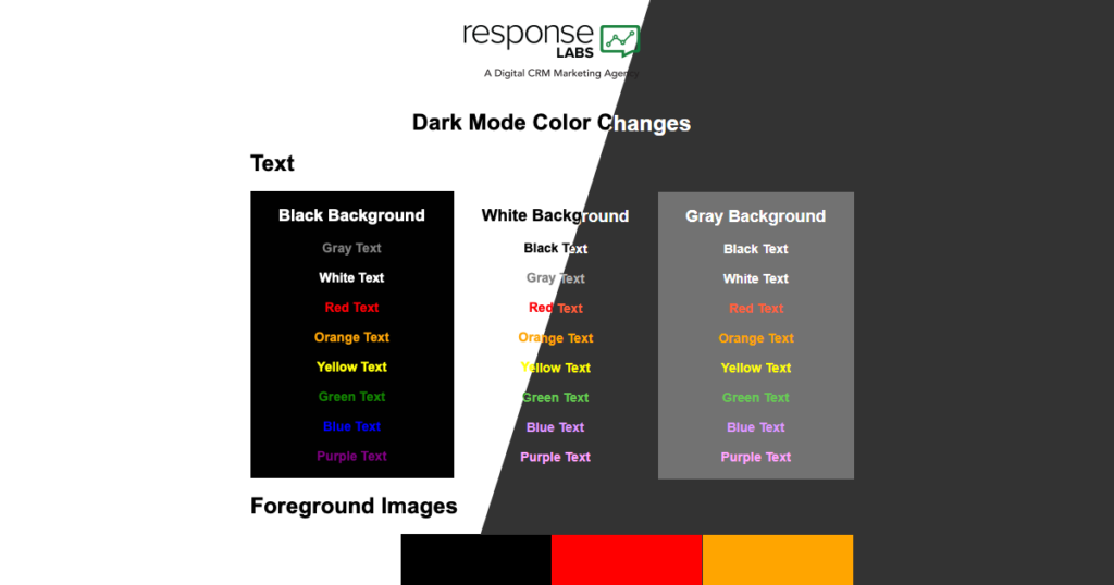
Ever since Twitter launched it’s “dark mode thematic interface” in 2016, “dark mode”, the inverted color palette, has grown from an option for a single website into a full operating system interface experience. It’s now available from all the major operating system developers – Apple, Windows and Google (Android) – across myriad devices from phones, to tablets, to PCs.
With such proliferation chances are high that a significant number of your subscribers are using dark mode on their devices. This means they will be viewing your emails in dark mode, which can alter your emails in unintended ways.
Three Platforms, Three Different Dark Modes
Dark mode is available on iOS, Windows 10, and Android operating systems. Each system differs in their implementation of dark mode, just as they do with their implementation of email standards. We used Litmus to evaluate dark mode on each platform. We looked at four main elements: font color, foreground images, background images, and background colors. Our findings are outlined in the chart below.

| Font Color | Foreground Images | Background Images | Background Colors | |
|---|---|---|---|---|
| Apple* (Apple Mail and iOS) | No change | No change | No change | No change |
| Windows (Outlook 365, Outlook.com) | Inverted | No change | No change | Inverted |
| Android (Gmail App) | Inverted | No change | Inverted | Inverted |
The only client that inverted the color of background images was the Gmail App on the Android platform. None of the email clients inverted the color of foreground images. The most significant inversions happen to HTML background colors. Nearly all email clients inverted HTML background colors in at least one way, with the most dramatic color inversions occurring in Outlook 365 and the Gmail App. The only email client not to invert HTML background colors was Apple iPhone mail.
Approaches for Handling Dark Mode
Here are three approaches for optimizing your emails to accommodate dark mode.
Check And Adjust
Checking and adjusting your emails is the easiest approach for handling dark mode. It involves testing your current email designs in dark mode, checking the color inversions, and adjusting any that may cause visibility issues for your subscribers.
Join the Dark Side
This approach requires the most effort, but eliminates the risk of your emails being altered if your subscribers are using dark mode. To join the dark side you’d convert your current “light” email templates into dark ones. This approach allows your team to better control the way your brand colors appear in clients with dark mode enabled.
The Dark Mode Meta Tag & Media Query
The dark mode meta tag and media query are only supported by Apple Mail and iOS Mail clients. So, in those clients, you can use the meta tag and media query to specify styles for the font and HTML background color elements that would be affected by dark mode.
To set dark mode CSS, simply add the following meta tags to the head of your email:
<meta name=”color-scheme” content=”light dark”>
<meta name=”supported-color-schemes” content=”light dark”>
Then add the following code to your CSS:
:root {
color-scheme: light dark;
supported-color-schemes: light dark;
}
And finally, add your dark mode-specific CSS within the following media query:
@media (prefers-color-scheme: dark ) {
/* Your CSS */
}
* Apple won’t apply dark mode to your email without the dark mode meta tag. If you enable this in your email, then Apple Mail and iOS Mail clients will invert your colors. To prevent this from happening, simply leave out the dark mode meta tag and media query.
If your audience is mostly Android and Windows users, then your approaches for handling dark mode are limited to Check And Adjust, or Embrace the Darkness. But, if your audience is predominantly Apple users, then the third approach you have at your disposal is the Dark Mode Meta Tag And Media Query.
Conclusion
The widespread availability of dark mode means that at least some of your subscribers are viewing your emails in dark mode. At Response Labs, our current approach with our clients to tackle dark mode development is the Check and Adjust approach. We’re looking forward to the widespread adoption of the dark mode meta tag and media query because it is the most direct way to ensure our client’s brand messaging is being received as intended, regardless of the subscriber’s device or interface.


